A veritable “poster boom” occurred in the early 1950s, driving forward two distinct styles, one consumer and one corporate. The first, labeled the 50s Style, was brightly colored and whimsical, while the second, called the International Typographic Style, was more rational and orderly.
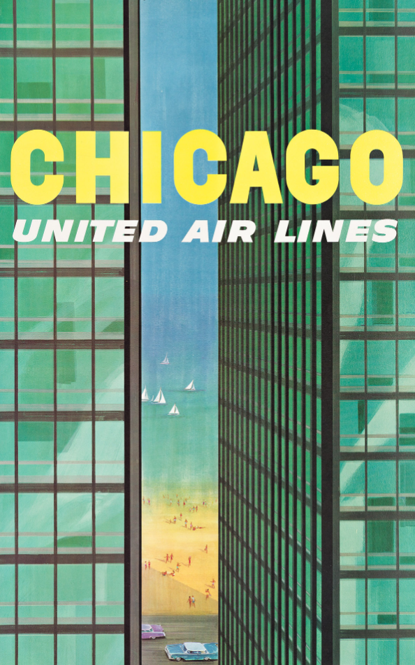
In an ode to the Modernist architecture of Chicago, artist Stanley Walter Galli gives us a slice of modern life in presenting a sliver of Lake Michigan and its beach between the two towers of Mies van der Rohe’s 1951 Lake Shore Drive “Glass House” apartment buildings. Galli playfully gives us a slice of the beach but the rest of this poster is all about the clean lines of Modernist architecture.
Stanley Walter Galli, Chicago, United Airlines, Circa 1955.
The excesses of the drug culture and political alienation led to a brief but spectacular Psychedelic Poster craze in the U.S., which reimagined the floral excesses of Art Nouveau, the heady repetition of Op-Art, and the dreamy juxtapositions of Surrealism.
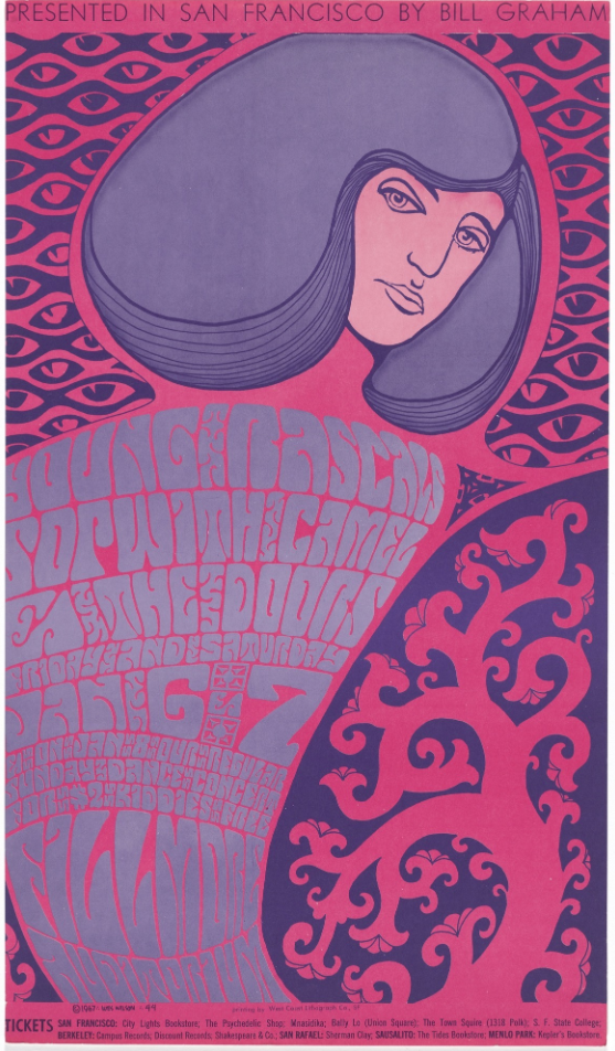
Wes Wilson’s posters would come to define an electric period of music advertising on the West Coast, one which borrowed heavily from 19th-century trends and which still manages to feel fresh and exciting today. Wilson exploits the use of morphed text, repetitive patterning and bold colours, similar to the late nineteenth century Secessionist artists who took Art Nouveau in different stylized directions.
Wes Wilson, The Doors, 1967 image c/o MomA
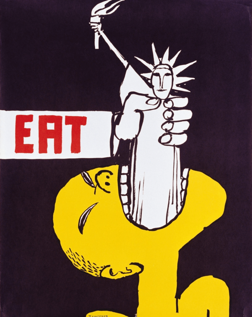
Born and raised in Strasbourg, Alsace, France, Tomi Ungerer was an award winning illustrator and a trilingual author. His work is renowned for pushing boundaries and challenging social conventions using quite simplistic child-like images to present powerful statements.
Ungerer was first recognized for his children’s books, for which he won many awards. His keen sense of the sociopolitical targeted with bold use of colour, and simple cartoon-like pop imagery, addresses hot button issues such as the Vietnam War,
racism, and greed.
This image shows a Vietnamese figure swallowing the Statue of Liberty.
Tomi Ungerer, Eat,1968, image c/o Wall Street International
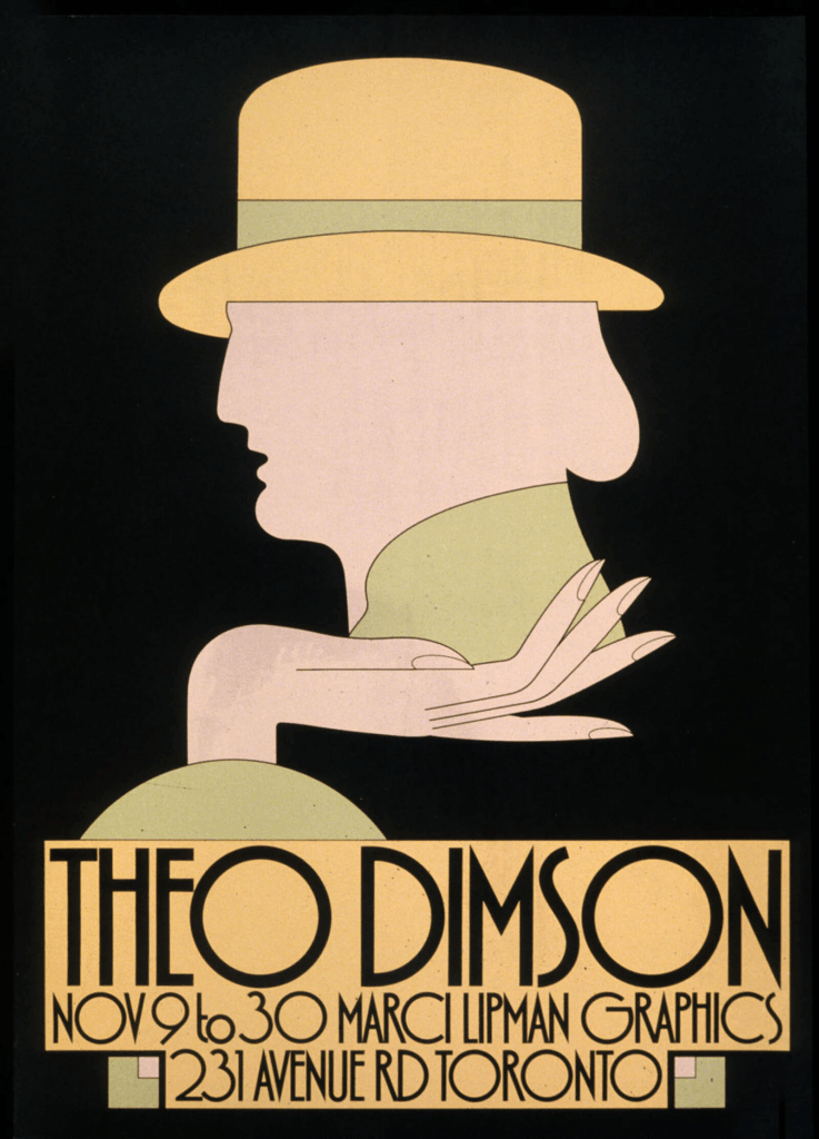
Theo Dimson grew up with comic books and magazines, he became interested in design at an early age. With a scholarship, Dimson attended the Ontario College of Art and Design and graduated in 1950. In this era of Mad Men, Dimson developed a singular and fluid style, often embodying one centrally placed larger than life character that had the Art Deco air of Jay Gatsby.
Theo Dimson, Exhibition Poster, 1978
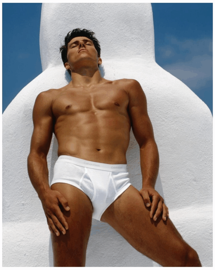
With one photograph Olympian Tom Hintnaus becomes Calvin Klein’s very first underwear model and helps to spark a craze that had fans ransacking bus shelters to steal the posters the prototypical viral campaign (pre-cellphone) sells three million pairs of underwear in just three weeks. Art or advertising, you decide.
Bruce Weber, Calvin Klein underwear ad, 1982
The artist Shepard Fairey went from street art, to graphic art, to fine art. Much like Ungerer he has his pulse on so many things and ideas.
I felt Obama’s biggest challenges were not being well established and not being white. In creating a poster that represented him as having a vision, with a stylised and idealised treatment, in a red, white and blue colour combination, I felt I could implicitly portray Obama as established enough to be worthy of an idealised portrait, almost like a two-dimensional statue – patriotic and American rather than being of any specific race.
– Shepard Fairey
Shepard Fairey, Obama Hope, 2009 based on a photo taken by Mannie Garcia for Associated Press

Posters have taken their place in the canon of art not simply because they are done by fine artists but simply because they capture our insatiable appetite for consumerism, for culture, for the pretty, and the political.